Portfolio of older work

Tuesday, April 29, 2014

Beth's House Post 2

Isn't that fabulous!!?!  This one is all thanks to Beth's inspiration.  The cloth is about a fat quarter size.  I had used it as a clean up rag before and it was dyed lightly and unevenly kinda lavender (see the light top part).   I added lines of black dye paste squirted out of a catsup bottle.  I let the lines sit a bit and then smeared them using a credit card and a silicon basting brush.  On the top I stamped letters using the same dye paste.  It sat about an hour before I did anything else to it.  Without washing it out, I decided it was a bit dull so I started adding drops of straight dye concentrate onto the fabric and let them bleed into each other.  After it sat for an hour, I rinsed it out and washed it.  Love it!

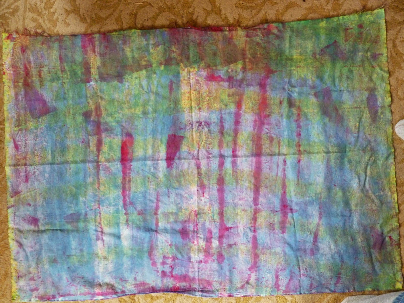
This is a 36 x 45 piece of cotton.  Previously I had monoprinted it with fushia and some blue (not sure which).  Clearly I had spread the dye  paste using a credit card for part of it also.  It was way too bright for me so I decided to try Ann Johnston's rope resist technique.  I wrapped it on the rope, scrunched it up, and soaked it in lemon yellow.  I thought the lemon yellow would blend well with the blue and would desaturate the bright fushia.  I did not get as much texture as I had hoped but I do like the results.  The piece is clearly a two-sided piece because here is the reverse side.

I think this cloth is a perfect candidate for Kathy Loomis tiny little lines technique!

Sunday, April 27, 2014

Art Show Opening

Today is the opening for the Student Art Show at UMA.  Work that was done in/for any UMA art class can be submitted for the show but then the art pieces have to be juried in.  I submitted two of my 30 x 22 inch prints from my print class last spring.  Not only were they juried in but they won in the Print division.  Yeah!  Here they are.  The bright white spots are the spotlight reflections on the glass.  Sorry I couldn't get better pictures.


Friday, April 25, 2014

A side trip to Beth's House

Beth has finished her chemo and radiation and is feeling so much better!  YEAH!!! What an amazing, courageous trip she has made.  Anyway, we got together last Saturday and played with making marks with black dye.  Beth experimented much more than I did so be sure to check out her blog. She will be posting her pictures later this week.

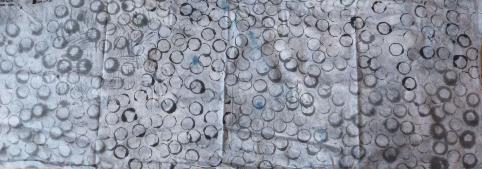
The first experiment was just too awful to look at. This was the second piece I made. I decided to name it Crop Circles since it is a cropped picture of the circle fabric. (My personal joke for the day.)  This one was an experiment in wetness.  Some of the circles were made with thinner dye paste and for some circles the dye paste was thicker.  That gave me different results in the amount of bleeding.  The second variation was in how wet the fabric was. For some areas the fabric was wet.  Other sections were dry when stamped but then immediately spritzed with soda ash water.  Lastly, some sections were stamped on dry fabric, allowed to set, and then spritzed with the soda ash water.  Here are some detail pictures to show the difference in bleeding.  So interesting.  Not an art cloth yet but interesting.


Watching Beth work, I loved what she was doing with a sea sponge so I used it on a cotton-linen clean-up rag that I kinda liked.  The mottling is subtle--partly because of the fabric I used--but the detail shots will show you how wonderful it is. This one is definitely an art cloth.

 Detail Shots.  I love the different saturations of the stamp.


Two more experiments to show on another post.

Wednesday, April 23, 2014

Color Wheels

For my Color and Light class I had to make three color wheels.  While time consuming it was very exciting.  I know!  I have made tons of color wheels before (boring!!) but the concept of this one was different.  All of the wheels are made with just 3 primary colors.  When I mixed the secondary colors, they needed to mix to gray with the primaries. Not too difficult because the primaries are set.  Then we had to mix the tertiary colors so that the complements would mix to gray.  That was much harder because everything was in flux.  Was the one tertiary color wrong or was it the other or did I simply mix the two tertiaries in a poor balance to achieve a true gray.  So many things to balance!

 
This one is based on Cyan, Yellow and Magenta.  The outside colors are the pure colors and the inside rings are the pure primary, secondary, and tertiary colors desaturated using the complement.

 
 This wheel was to use two of the primaries from the first color wheel and then a variation of the third primary.  I chose to use the Cyan and Magenta but substituted Lemon Yellow for the Yellow. The biggest difference should be noticeable in the yellow and the complement that had to match it.


This wheel is based on variations of all three original primaries, Cyan, Yellow and Magenta.  I used Lemon Yellow, Vermillion, and Cerulean Blue. The vermillion is really orange which not only gave yucky reds but also made my purples really muddy.  To make a good complement for the vermillion, the greens are also bluer than expected.

 Many artists choose to create their art work using just three primaries so that all the colors are harmonious.  This exercise certainly showed why that makes good sense.

Monday, April 14, 2014

A Color Controversy and Wheel

A Color Controversy and Wheel

There may be controversy over how many colors of dye are really "needed."  The simplest answer is that I don't know how many colors YOU need. But let me explain why I plan to use the 14 pure colors.

It is true that to create all the colors on the color wheel an artist only really needs red/blue/yellow or magenta/cyan/yellow, depending on the color wheel preference.  Some artists restrict their colors to only those three. The reasoning is that all the secondary and tertiary colors will be made up of the same primaries and will therefore be harmonious.  That makes sense when the pigments are bound together in a paint.

The procion dyes are not bound together. When I mix a red and a blue together to make purple, I still have red powder and blue powder rather than purple powder.  Each of those powders have their own unique properties meaning they will bind to the fabric (with soda ash) at different rates. This is what creates the "color splits" that we dyers talk about all the time.  The 14 pure colors won't split.  The 14 colors mixed together will split (give a different color aura) depending on each color's unique properties.

So, in low water immersion dyeing when I want a mottled fabric, I might choose to use more than one pure blue so that the blue dyes might split and add extra depth and interest to my finished fabric.  Just think of the possible splits you can get by using one pure red and multiple pure blues when mixing a purple.  I might even use the turquoise blue dye that has a bit of green in it in order to desaturate the red dye and add that additional element in the finished product;  I might end up with a turquoise split.  If I used a yellow to blend with the blue for a green, I might end up with a yellow split.  It is all about the possible splits.

That is why I will use all 14 pure dyes from Prochem and, if I were in Europe, I would be using the additional pure colors they  have access to. To better understand the properties of the pure colors  is why I created my own dye color "wheel" and will be making a color dictionary.


Here is my color "wheel."  I simply placed a few drops of each pure dye concentrate where I thought it would fall on the color wheel.  I could have been much more restrained and tried to constrain the colors but I chose to let them bleed together.  You will notice that I did go back in to circle and label where I thought the color was most true. And here are detail shots.


Saturday, April 12, 2014

Color Study

 I love working at a University so that I can take free classes. This semester I am taking an art class named "Color and Light."  I thought I knew colors but I am learning a lot.  And now I am taking you on the journey.

Lesson one:  DYE COLORS

Let me start with the dye colors. Do you ever get confused about which blue, yellow, or red to buy?  I know that I did.  And then the zillions of colors that you can spend your money on.  Which ones are fabulous and which ones will sit on your shelf?  And how many of them do I need? Ann gave me some valuable clues.

Did you know there are only 14 pure MX Procion Dyes?  At first I thought that meant "pure" like you use the term for colors on a color wheel.  I was expecting a color wheel full range of colors.


Not quite.  The MX pure dyes are those made from one substance.  ALL of the other colors are mixtures of the pure dyes.  You will  notice when you see the list that there are 4 yellows, 1 orange, 2 reds, 2 purples (neither of which is called purple), 5 blues and NO green.

So the answer to which colors are necessary is 14.  All other colors are mixtures of these 14.  Now that doesn't mean not to ever buy any other colors.  I love Chartreuse and find it more practical to buy it mixed than to mix it each time.  You might have favorite mixed colors that you want to keep buying. But do start your buying with the 14 pure colors.

Here is the list of the pure colors from Prochem.  You can order similar ones from Dharma but Prochem was nice enough to post a list.  I was going to copy and  paste the list here but it copies poorly.  You will have to use the link to read the colors. The list from the Prochem site does print very nicely.

My first step when I learned that fact was to go through my dyes and find out which ones of the pure dyes I had and then order the rest.  I won't bore  you with how many OTHER reds, greens, oranges, pinks, etc I had.

My  next step was to go to the store and buy containers to mix and store my dye concentrates in.  I dye often enough that I can store some dyes already mixed with water (NOT soda ash water) in the fridge without worrying about the dye's losing their strength.  Now when ever I want to dye, I don't have to hunt down my mask to mix the dye powders!  One messy step already accomplished! The dye concentrate recipe is: 1 Tablespoon of dye powder/ 2 Tablespoons Urea/ enough water to make 1 cup of concentrate. Shake.

Just a note:  I wish that I had a separate fridge for all my dyes but I don't.  I store my dyes in the same fridge with my food.  The mixed dyes are clearly labeled, in similar containers, that container shape is not used for anything else but dyes, and they are in a designated location in the fridge.  With those rules I don't worry about my  husband and me mistaking the grape dye for grape juice.  But I don't have kids at home anymore either.  If you have kids, you might think about how to handle that problem before storing your dyes.

My  next project is to develop a color wheel of the pure dyes.  That will help me decide which of the 4 yellows and 5 blues I want to mix together to get green.


Note: Part of this post was taken from my post on And Then We Set It On Fire.