Portfolio of older work

Saturday, November 22, 2014

A Second Inspiration


Before I show you a fabulous artwork I am using as a second inspiration, here are some more components for the new quilt.  I made the mistake of counting how many components I have sewn.  Including these seven, I now how 36.  I need at least 100 before I start to assemble. *** heavy sigh**** Oh well, it will take awhile but hopefully by then I will have several more artworks for inspiration when I start to assemble the components.


So, here is the second piece I am using as inspiration.  Could be a quilt, huh?  But it is a paper collage.

LANCE LETSCHER Showboat, 2008. 
Collage on board. 74” x 50.”
A large commissioned piece by Letscher is part of The Austonian art collection. Using discarded vintage ephemera such as found paper, book covers, old magazines and record covers, Lance Letscher creates collaged compositions of astounding intricacy and craftsmanship.  Here is what one critic said about the piece:

"His compositions, driven by a piecemeal aesthetic with a meticulously obsessive sensitivity to color and content, evoke both the expansiveness of the cosmos and the complex detail of microcellular life forms. Crafted with a rich and vibrant vocabulary eliciting discovery by his viewers, Letscher’s works engage us with their poetry and intricacy."

Yeah, yeah, yeah.  I don't have a MFA so here is my look at the design elements.

1.  Again I chose a piece that has a motif.  Do notice that while the rectangles change sizes and colors, their orientation is always in the same direction.

2. Again, the focal point is made primarily by the change in color to warm color vs the mostly cooler rest of the composition.  Again, the focal point is off center but still integrated into the entire composition.

3.  I think the color range is far more expansive that I am planning or that Heather included in her quilt.

4.  Heather had a value variation from top to bottom and I don't see that here but there is a lovely value variation from left to right.  It would have been really easy to just fade into dark on the edges but the bottom right has the value coming back up to a light again.  I like that. Makes the surface look like it ripples.

5.  I love, love, love the layering in this piece.  There is real visual depth with rectangles floating on an interesting background.

6.  The one thing that really strikes me here is my need to get closer to see more details.  At the first Maine Event I discovered that really good artwork needs to be interesting at three distances.  From across the room so you want to get closer.  From about 6 feet so you want to stop and look longer.  And lastly from as close as you can get to see the secret little details you can only see when you get close.  I am sure this piece has those little secrets and I want to get much closer to see them.  I absolutely want some little details you can only see up close in my quilt.

Yep, a real inspiration for me.


Wednesday, November 19, 2014

Dino Hats for Charity


My church is making dino hats for the Maine Children's Home for Little Wanderers.  It is a Maine based charity that serves families.  Its Christmas Program provided Christmas for over 1700 children in Maine last year.  One of the items all children receive for Christmas is a new hat and mittens.  We are hoping to make 50 of these dino hats to donate.  We took the pattern from here.  They are really easy to make and cost about $1 a piece in materials.  Here are some of the ladies cutting and sewing.


Monday, November 17, 2014

Inspiration For My Voice

Or a jumping off  point or whatever you want to call a couple of artists/art works I want to use to get my creative juices going.

I have already started my next quilt and have a few rules for it.

1.  Pink and Green are the primary colors.  Now you know that I am going to be using more than just pink and green but that is the starting place.

2.  Lots of tiny piecing.  I like to piece.
3.  Hand dyes and commercial prints.  I know, some people don't like the commercial prints but I like the excitement they bring. They do need to be cut small enough so that they read abstract or as a solid.

4.  A "Flying F" motif.  I developed it for a workshop with Nancy Crow and want to use it again.
5.  And, of course, abstract.  Always abstract.
Not too many rules but it is nice to know my rules before I go looking for inspiration to move me forward.

Special thanks here goes to Kathleen Loomis who has posted pictures of the Quilt=Art=Quilt Exhibit at the Schweinfurth Memorial Art Center.  The next art work/artist is in the show and I took the picture from Kathleen's blog.

Heather Pregger, Tuning Fork #11, 72 x 54"

 I love Heather's Tuning Fork series. 
Several design elements I want to make sure are in my new quilt!

1.   I have not seen one in person but doesn't it look like she uses some printed fabric, at least in the grays? 

2.  I like that the tuning forks are not all the same size. Is it fair to say that the majority of the red tuning forks are smaller than the majority of the  gray ones?  Or are the tuning forks just smaller as they enter the focus point, which is primarily red?  Now that I think about it I think that they are smaller offering more intricacy in the area she wants your eye to stay on longer.  


3.  I like the change of color from light in the top left and darker in the bottom right. 


4.  I love the focal point.  Red splashes are seen in other areas but the reds are primarily clustered together to form a focal point.  And the focal point is not in the center either vertically or horizontally.  


5.  I like that the tuning forks seem to be both right side up and upside down.  


6.  And of course, she is using a motif.

First inspirational artwork/artist chosen.  Check!  A couple more artworks/artists to go.

For now, a picture of some new components for my new quilt up on my design wall. (Boy, do I need to find my lint roller!)


Sunday, November 16, 2014

Ten Free Textile Books!

Sounds great, doesn't it?  Just go here to register for your chance to win them.

Wednesday, November 12, 2014

Cogitations on Cogitations

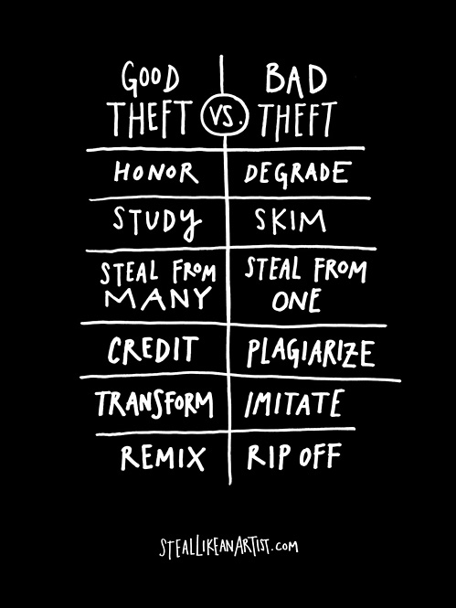
Do you read Elizabeth Barton's blog, Art and Quilts, Cogitations Thereon?  I always look forward to a  post there because it is a free art lesson.  I especially liked her latest post, Original? Or Derivative? When is a Clone not a Clone?    Elizabeth said (though you need to read her whole article) that you can start with someone else's work as an inspiration but then you need to "go beyond,"  do something "unexpected,"  "going beyond the predictable," something the original artist would never even think of.

Somewhere else recently the topic of originality was covered.  I think it was on DesignMatters TV with Laura and Linda Kemshall.  Linda stated that it was fine to be inspired by someone else's art but to not limit your inspiration to one piece and one artist only.  The danger, like Elizabeth Barton said, is that you end up being derivative.  For Linda the key to being unique in your voice is to use a variety of inspiration to make one art piece of your own.  You know, this element from that, and this thing from that, etc and then put them together in a way that is all yours.

Beth Berman, who is always looking for creative inspiration, wrote a post on the Fire blog titled Priming the Creative Pump!  She refers to a new book she is working her way through.  I mention Beth because she lent me another book on creativity named, Steal Like an Artist: 10 things nobody told you about being creative.  Here is Austin Kleon, the author's take on being original vs a clone.


Wonderful posts, each and everyone.  I probably like them because I agree with them.  LOL So, my  next post will be some quilts that inspire me to create in my own voice.  And, if I am really lucky, a shot or two of more components of my latest quilt.

Saturday, November 8, 2014

Starting a New Quilt

Just a few components up on my design wall.  Only several hundred more to make.